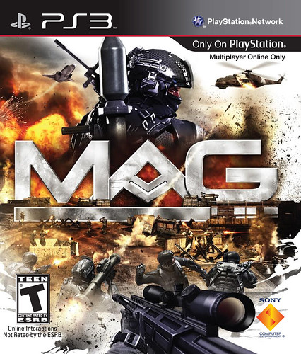
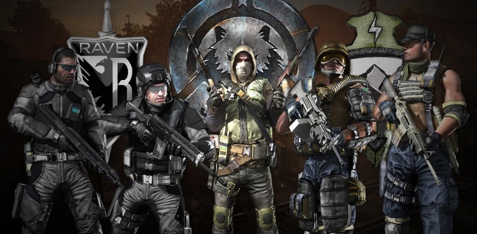
With Zipper Interactive’s 256-player FPS extravaganza, MAG, preparing for launch in less than a week, the official MAG Box art for the other two Major gaming regions of the world, Europe and Japan, have been finally revealed. Read on to see how all three compare to one another and decide which you think is the victor in the battle of the box art, MAG-style.

First up, we have the European box art which is similar to the American box art, but instead of RAVEN soldier taking front and center, a soldier of VALOR is leading the way, since VALOR is based in Europe, America, and Mexico.

Next up is the Japanese Box art…which is interesting, as it looks more like a Straight-to-home DVD cover art rather than the artwork for a major video game release. Then again, this is Japan we’re talking about..just take a gander at the JPN box art for Heavy Rain. What’s up with them and only showing a certain body part? Weird.

And finally, we have the US Box art, which in my opinion is the best of the best, even though we have a RAVEN soldier on the cover, with their faction consisting of Western Europeans and all. Perhaps the more futuristic look of RAVEN is more pleasing to the American eye.
With over 1 million gamers worldwide who downloaded the final Beta, it seems that MAG is on the road to success, regardless the quality of the box art. Which box art is your favorite? Will you be picking up the game starting January 26th? Or did the Beta ruin it for you? Let us know in the comments below.


